
01 / 09
Original Concept
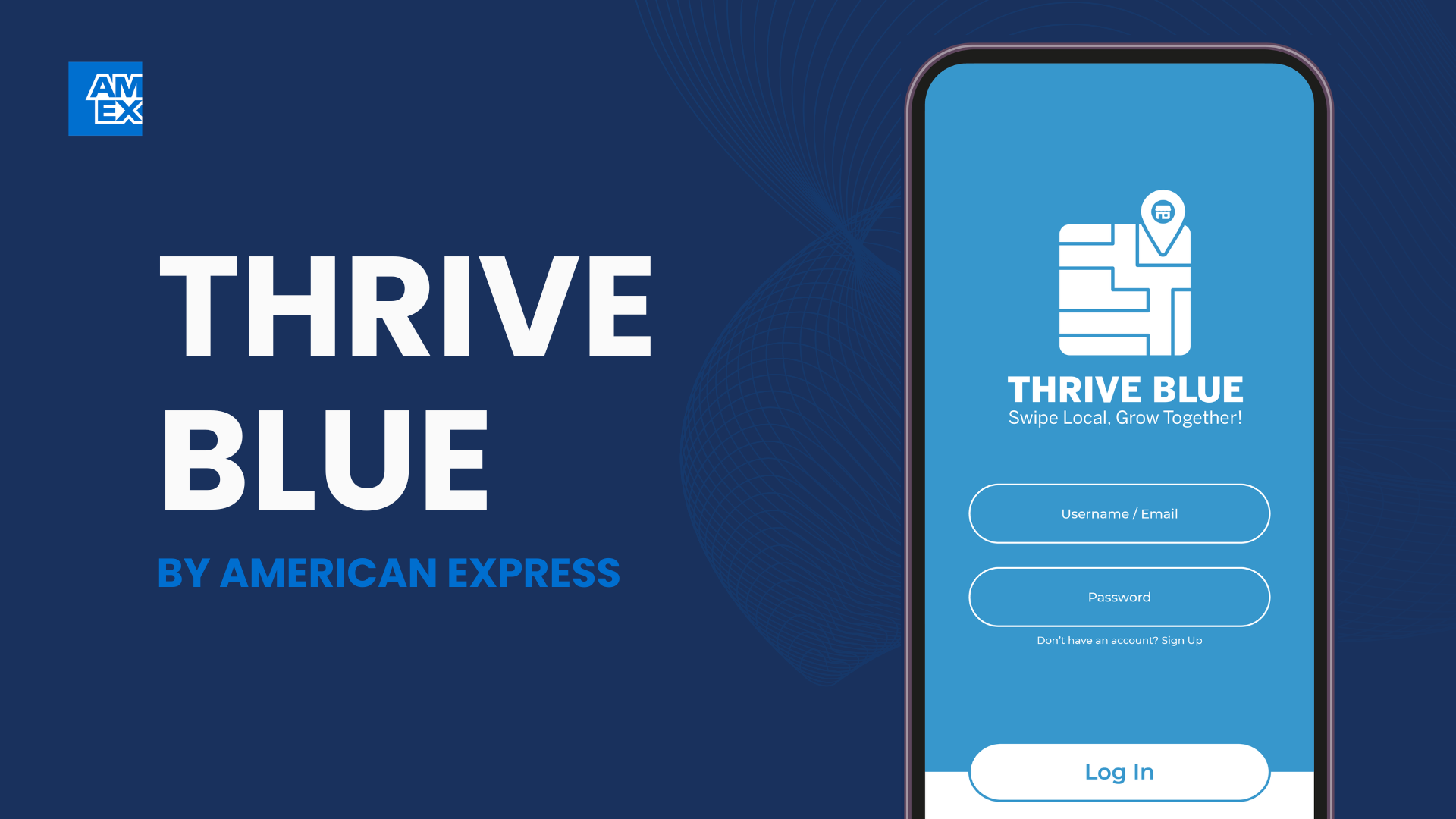
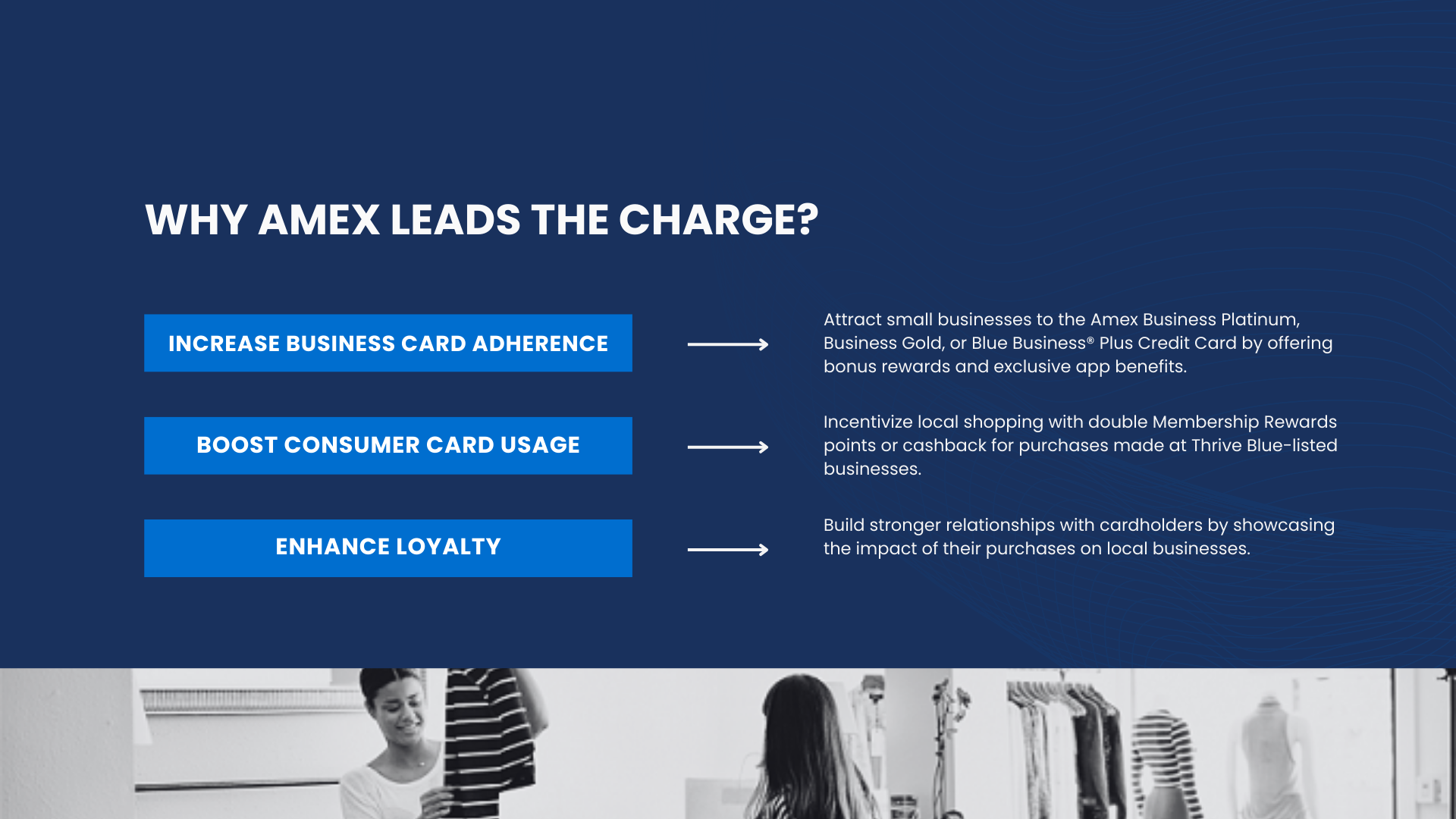
Thrive Blue is a concept project exploring how American Express could support local small businesses while encouraging card usage and loyalty. This presentation walks through the business opportunity, the strategic rationale, and the proposed experience in a simple slide-by-slide format.
More Where That Came From...
View All Work →